Disclaimer:
ThePrograminTechnicalCommunicationtriestoensurethattheinformationisprovidedonthis
websiteishelpfulandaccurate.Itisimportanttorecognizethatthecontentprovidedaregeneralandthat
satisfyingtherequirementsofspecificcontexts,suchasclassroomassignmentsorworkplacesituations,may
involvesomemodification,supplementation,oradaptation.
Author:
Dr.EricKumpf,PrograminTechnicalCommunication,UniversityofMichigan
Designing PowerPoint Slides

Designing PowerPoint Slides
Many engineers use the default settings in PowerPoint when designing
slides, which often leads to ineff ective slides. Often, these ineff ective slides
rely on text and are over-designed with unnecessary embellishments and
decoration. These ineff ective slides then appear in a medium that is better
suited for displaying visuals.
Below, a common way of designing slides (left column, using default
settings) is compared with a better way (right column) that emphasizes
visuals over text.
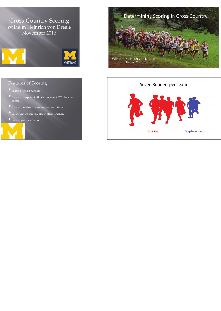
1. Screen size is the 4:3 ratio default in PowerPoint.
Some older projection systems use a 4:3 ratio,
but newer ones are set for widescreen
2. Templates encourage many non-data pixels;
decoration instead of data.
3. Title slide has text only, no visual of topic.
4. Overbranding on all slides; contributes to many
non-data pixels,
1. Screen size is 16:9 (or 16:10) widescreen. Many
current screens are widescreen, so set your slide
dimensions to match.
2. No template. A blank slide is the best starting point.
3. Title and visual on title slide. The title, as an option, can
make an assertion that the presentation supports.
4. Branding, if used, subtle, only on title slide. Audiences
do not need to be reminded of author affi liation.
Title slide, 16:9 ratio, widescreen
Interior slide, 16:9 ratio
Title slide, 4:3 ratio, PP default
Interior slide, 4:3 ratio
ineff ective
eff ective
Robert Herkenham
Robert Herkenham
To learn even more about
designing good PP slides, see
The Craft of Scientifi c Presentations
by Michael Alley.
1 of 2
5. Generous use of bullet lists. Giving audiences
text to read interferes with listening to the
presenter (reading and listening are processed on
the same side of the brain).
6. Interior slides are mostly text. Easier to type text
than take the eff ort to fi nd or create useful
visuals.
7. Clip art. Cheesy, sub-optimal.
8. Low-resolution (fuzzy) visuals. Often downloaded.
9. Presenter reads from slides. Reveals a lack of
rehearsal and unfamiliarity with the topic.
10. No handout that documents the presentation for
the audience. Default printout of slides has poor
resolution as visuals are reduced in size.
5. No bullet points. Visuals instead. OK to have
some text, as in labels or an assertion at the top,
left of the slide. That assertion is supported by
visual evidence. Visuals are processed by our
brains diff erently than reading and listening, so
we can process visuals while listening to
presenters.
6. Mostly visuals. Visuals for a visual medium
(slides).
7. Original art, photos.
8. High-resolution visuals. Original or from image
libraries.
9. Presenter does not focus on screen, looks at
audience. Reveals rehearsal and familiarity with
the topic.
10. Paper handout (one sheet, duplexed?) with
takeaways of the presentation. Can add notes
to slides in the Normal mode of PP. Handouts
accommodate people unable to attend the pre-
sentation and attendees who want copies. These
post-presentation audiences view the slides/
handout without listening to the live presenter.
Title slide, 16:9 ratio, widescreen
Interior slide, 16:9 ratio
Title slide, 4:3 ratio, PP default
Interior slide, 4:3 ratio
ineff ective
eff ective
Robert Herkenham
Robert Herkenham
2 of 2
